An exciting survey showcases American modernism in the decades before New York became the art world's even cooler epicentre
Just how cool is America’s Cool Modernism? Stuart Davis’s painting of a Greenwich Village street scene, Jefferson Market, New York, from 1930, is surely an example of modernist cool well before New York’s art scene became an internationally cool phenomenon – and even though the painting is, naturally, inflected by Old World newness: its flat, intersecting geometries suggest a Cubist collage, while its jaunty graphic iconography, including the decorative flourish of the arabesque curves of a street lamp, embrace a School of Paris gaiety. It’s an alluringly cosmopolitan yet unpeopled scene.
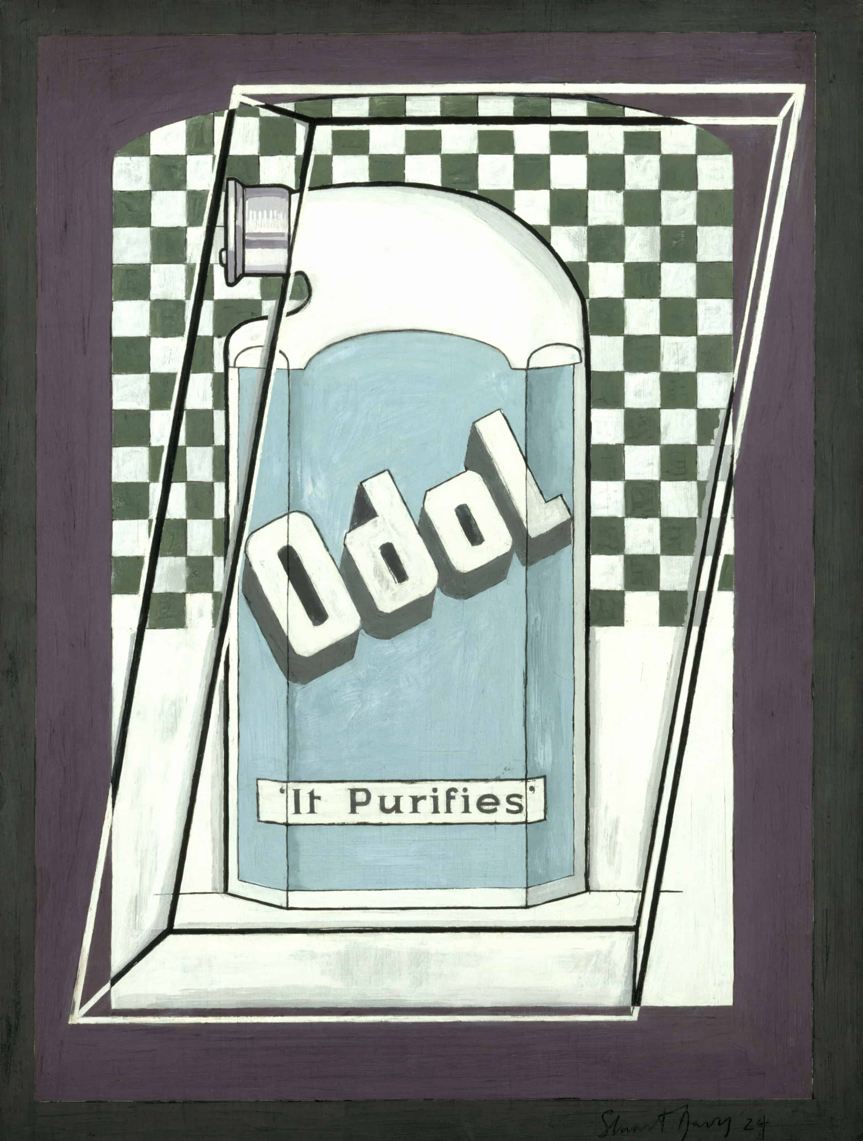
Davis had spent a year in Paris in the late 1920s, but his later paintings, with their clean lines, complex layerings, riffs and reworked motifs, attempt to capture the American vernacular of jazz. And while these later works fizz with exuberant colour they also possess a studied intellectual rigour, a seductive heat tempered by intricate mapping. And more than three decades before the affectless cool of Warhol, Davis was featuring commercial logos and products in his paintings with exactly this type of coolly meticulous rigour. In Davis’s Odol, 1924, also in the exhibition, a diagrammatic depiction of a bottle of mouthwash, featuring the brand’s tagline “It purifies” and in glacial shades of blue and white, is framed by rectilinear lines tilting elegantly at a diagonal.
It’s this notion of cool as detached and minimal that’s explored in this survey of American painters and photographers working in the 20s, 30s and into the early 40s, while the title also suggests that American art didn’t need to wait before the rise of the ballsy abstract expressionists to claim its cool credentials.
It features a host of artists little heard of in the UK – Ralston Crawford, John Raphael Covert, German émigré George Kelpe – alongside the bigger names of Edward Hopper, Georgia O’Keeffe, Marston Hartley and photographers Paul Strand and Margaret Bourke-White among others. Then there are the names who are only now beginning to crop up with increasing frequency in surveys of the period, including Arthur Dove and the African-American painter Jacob Lawrence. A highlight for me was Morton Livingston Schamberg’s schematic depiction of a machine part in his 1916 painting Untitled (Mechanical Abstraction). And how many are familiar with the paintings of the poet E E Cummings? His 1919 painting Sound visualises sound waves in a tumble of colourful and bold Cubist forms.
Unlike many of the later abstract expressionists, with their internal struggles of the psyche, many of these artists were preoccupied by the metropolis and its dizzying Manhattan skyscrapers, as well as the dehumanising and denaturing effects of modernity. They offered a vision of urban America that provided a counterpoint to American Regionalism, a movement that was flourishing concurrently and which is also represented here with three soft lithographs of a romanticised, and folksy, rural Mid-West by one of its best known proponents, the Iowan-born Grant Wood.
Other artists were associated with the Precisionist movement, the most talented of whom was Charles Sheeler. Here, with his meticulously smooth brushwork, modernity takes on an imposing and alienating force. Sheeler’s images are devoid of people, his paintings of industrial plants pared down to a series of exquisitely modelled geometric forms and structures, delineated with studied precision. Towering elevator bins and silos are tightly framed within high horizon lines and with an almost worm’s eye view. They suggest the awe and terror of a new sublime, inspired not by the power of nature but of the machine.
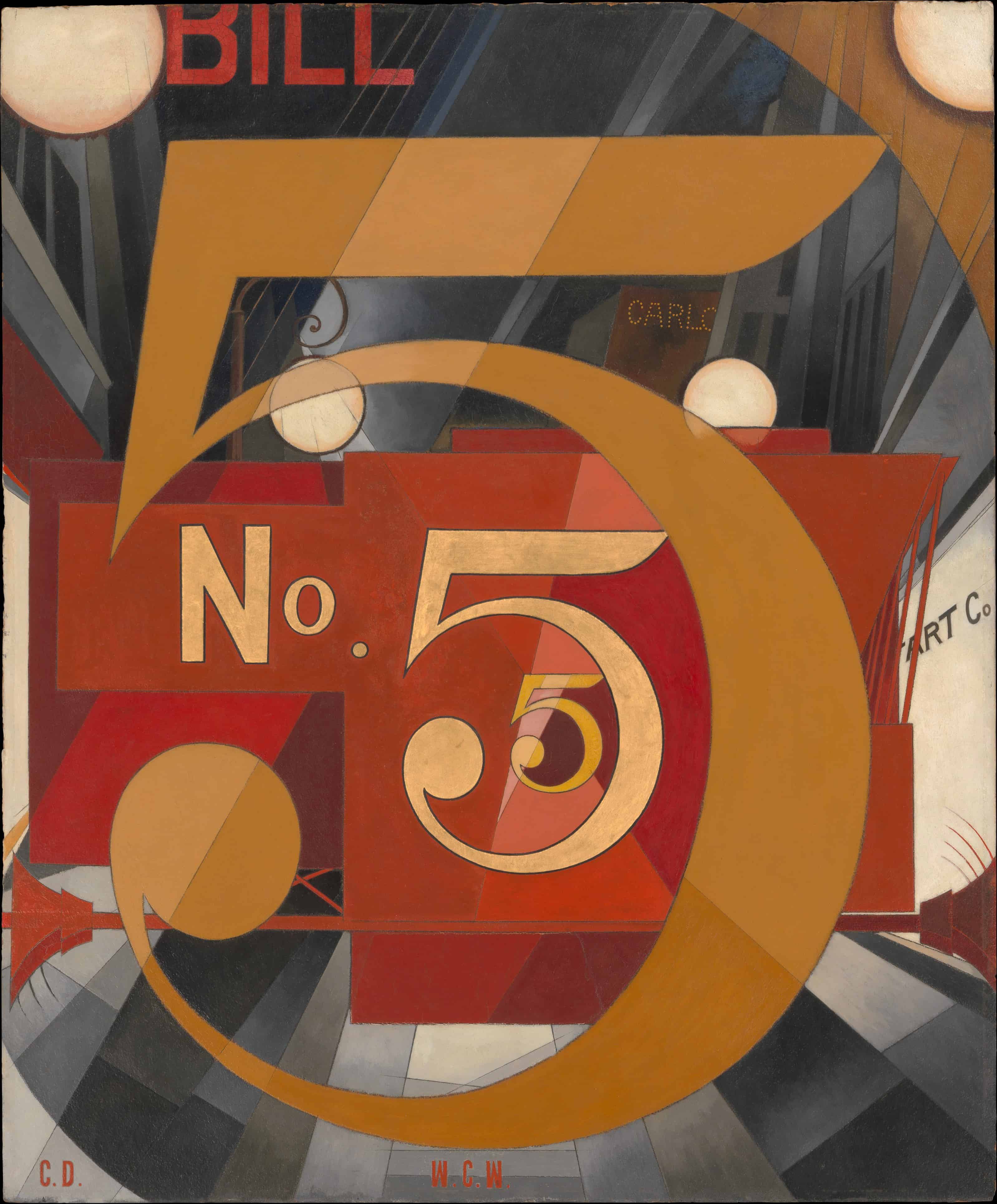
And finally, what a coup it is for the Ashmolean to have Charles Demuth’s 1928 masterpiece, I Saw the Figure 5 in Gold, a homage to his friend William Carlos Williams and his poem The Great Figure. Three figure 5s, the largest one of which abuts the picture plane, ring out the number of the firetruck, itself suggested by just a series of interlocking red square, as it ostensibly speeds towards us. It may not convey the dynamism of actual movement – with its arresting art deco typography it is elegantly static, and anyway what cubo-futurist art work really does? – but 90 years after it was painted it still conveys the exhilaration and sensory overload of living, and breathing in, the city.


