A survey of the conceptual artist's Wall Drawings at Fundaçion Botín in Santander
Any exhibition of Sol LeWitt’s work raises an interesting question. Why go and see it if it’s the idea that’s the most important aspect of the work? In his 1967 essay, Paragraphs on Conceptual Art, he clearly outlined the predominance of the idea over material form, which may seem an obvious statement to make about conceptual art (the label’s on the tin) but LeWitt went further. “All of the planning and decisions are made beforehand and the execution is a perfunctory affair,” he wrote. “The idea becomes a machine that makes the art.”
This was not only an affront to traditional notions of art, but he was also steering a clear path away from the Duchampian readymade, which had gained ground with other American artists emerging in the Fifties, predominantly Jasper Johns and Robert Rauschenberg. He was still interested in the production of the work, but of the work being liberated from its creator – though here I’m bound to say I’m not sure that the musical analogy he favoured, between that of the composer creating a “blue print” and the musician interpreting it, can be so easily applied. There is nothing “perfunctory” about interpreting a musical score, after all. What’s more, the composer’s score is about imparting feeling and mood that elevate it beyond notations merely for emissions of noise according to length of sound, or the point one sound is overlaid with another. Nonetheless it’s an analogy that John Hogan, close collaborator of LeWitt’s from the early Eighties (LeWitt died in 2008) and co-curator of 17 Wall Drawings 1970-2015 at the Fundaçion Botín in Santander, the first major exhibition of the artist’s work in Spain, stresses himself.
As for the more general point of the “liberation” of the work from its creator, rather than the Duchampian model, perhaps LeWitt is far more closely aligned to minimalist artists like Donald Judd, whose pristine metal boxes were manufactured by hands other than his own, following Judd’s exacting specifications.
You had the finite object, and that was that. Judd’s coloured steel boxes, or Flavin’s pre-manufactured fluorescent light fixtures, don’t, according to LeWitt, continue to live and evolve – which, you may counter, is strange, since this is exactly what art is meant to do in the perceiver’s mind. That’s what art does, after all. But what LeWitt meant was something more practical. He meant that the work could be assembled or drawn, according to his specifications, anywhere and at any time. Art was therefore reduced (or freed by – however you wanted to look at it) to a list of concise instructions that are adaptable, taking in the measurements of a particular wall, or incorporating, say, a fire-alarm fixed in a corner. And once an exhibition is over, its particular manifestation would no longer exist. It would simply be painted over. All that would exist is the instruction – the work as an idea in its purest sense.
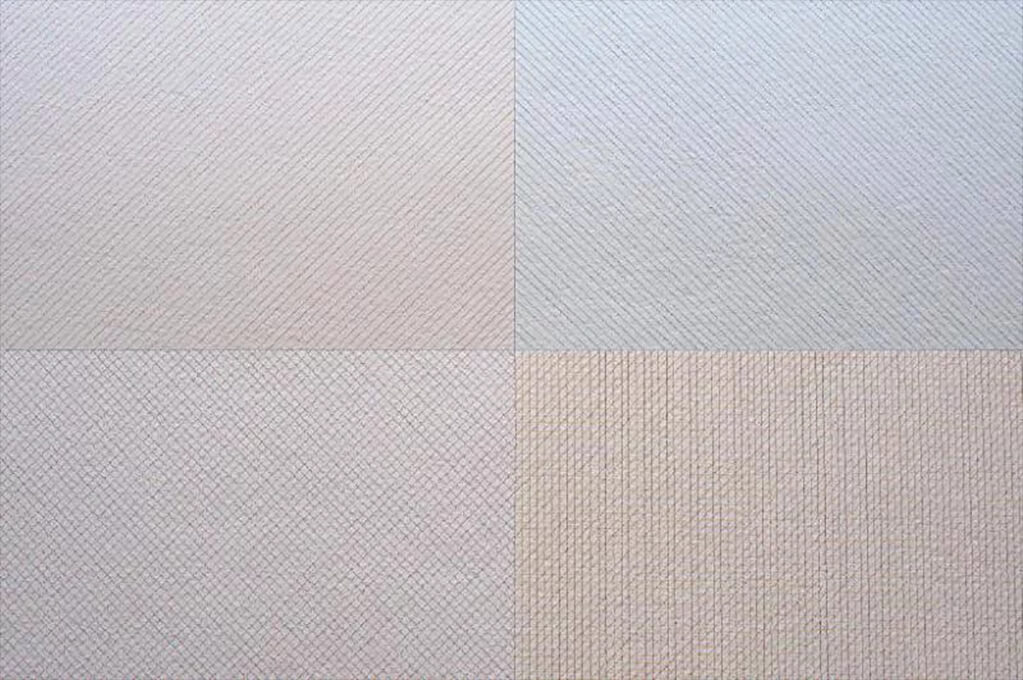
Between 1968 and his death, LeWitt created more than 1,200 Wall Drawings. Some he executed himself, but most were executed by a team of studio assistants, and the drawings continued to be fabricated after his death. One work at the Fundaçion Botín, where 17 have been selected by Hogan and the gallery’s artistic director Benjamin Weil (and painted by four fabricators from the LeWitt Studio, and 15 local volunteers), is the oldest, though it’s dated 2015 since it’s the very first time its been realised. The work, Wall Drawing 7A, presents a rectangle divided into four equal squares, each featuring lines so closely rendered that it makes you go cross-eyed. With its vertical, diagonal and criss-cross lines in different shades it strongly resembles the subtle and seductive minimalism of an obsessive Agnes Martin painting.
The works range from the bold to the barely perceptible. A work at the exhibition’s entrance, for instance, is so quiet that it’s easy to walk past it without noticing. Featuring thick lines in white on a white wall, the lines are differentiated only in the way the paint reflects light. Once you see it, you find a subtly changing work.
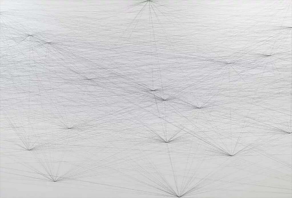
Some Wall Drawings come with instructions that are simple but which result in a work that looks startlingly complex, while some works look simple but come with instructions that are headache-inducing – great if you’re a maths wizard. The directions for Wall Drawing 237, 1974, read: “A trapezoid whose top side is half as long as its bottom side and whose left side is one and a half times as long as the top side and is located where a line drawn from a point hallway between the centre of the wall and the upper left corner.” Another simply consists of a single sentence about random points connected by straight lines (Wall Drawing 118, 1971) yet the results are dizzying.
So in answer to the question in the introduction: it’s the intricate interplay between concept and realisation that make an exhibition of LeWitt’s work worth seeing. Once you know the method behind each of these huge fresco-like paintings and drawings – each executed according to the specifics of the space – one gains a deeply satisfying sense of that intellectually rigorous relationship.

