An exhibition about how geometric abstration took over the world loses the plot.
From an apparently simple idea stems a very confusing exhibition. Here’s the idea: taking the seminal black square painted by Russian artist Kazimir Malevich as its starting point – in fact, a rectangle, with the small and undated Black Quadrilateral the first of three Malevich paintings – we are invited, over the span of a century and across a number of continents, to explore the evolution of geometric abstraction and its relation to “ideas of utopia”.
So far so good. Or maybe not. Perhaps the time frame hints at the problem: the way it jumps, without pause, from those modernist isms with their big ideas and proceeds to chuck everything but the kitchen sink at it. There are so many artists I’ve never heard of in this baggy, over-curated, over-extended display, all clamouring to say something tangential about abstraction, figuration, architecture, design, squares and circles, each from their own time perspective (modernism, conceptualism, performance, post-modernism, post-post-modernism) that you wonder at what point the curators got so carried away and lost the plot.

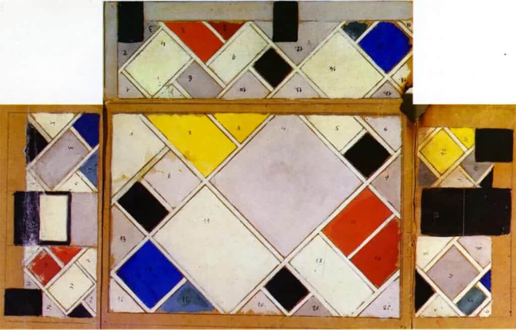
Theo van Doesburg's Colour design for ceiling and three walls, small ballroom, conversion of the Café Aubette interior Strasbourg, 1926-7 (gouache on paperboard)
All these ideas are interrelated, of course, because that’s how ideas in art work, but I also wonder what, meaningfully, a piece of Dada theatre by Oskar Schlemmer has to do with Lebanese artist Saloua Raouda Choucair’s stack of brick-like forms from 1965, or what either has, really, to do with the starting premise. Or what the Islamic tradition of non-representational art has to do with Western modernism in anything but the most superficial way (“Look, shapes”?). The trouble is, this is an exhibition that wants to say one big thing and ends up saying lots of little things with diminishing returns. And there are so many problems with that that it’s difficult to know where to begin.
And, of course, one can make so many of the same points by just looking at the course of figurative art and political engagement in the 20th century – from utopia to disenchantment and back again. It’s easy – we can all play this curatorial game and get lost in a spaghetti-junction of half-baked ideas but from a completely different starting point. And in fact there’s a surprising amount of figurative work in this exhibition: photographs of modernist buildings and radio towers and corporate office interiors; paintings of loudspeakers à la Rodchenko; and lots and lots of performance pieces taking us to the present day.
What’s more, we end with an installation piece by Heimo Zobernig showing a plaster cast human mannequin. I’m not sure why. And I’m not sure I care why, because the narrative thread has already been stretched in so many directions. Anything could have gone in to this survey and more or less anything could have been left out. Modernism is that big, that all-encompassing, and its repercussions that seismic. That’s the problem – this is an exhibition crying out not only for some serious editing but for a serious rethink about what it’s trying to say.
There’s some really good work in this exhibition, so by all means enjoy it for that – it doesn’t get better than El Lissitzky’s architectonic “prouns” or Mondrian’s delicately balanced grids. What this curatorial exercise lacks is clarity and purpose. In fact, it’s a mess. It’s the first major exhibition of the year and already I’m thinking it may well be one of the worst.